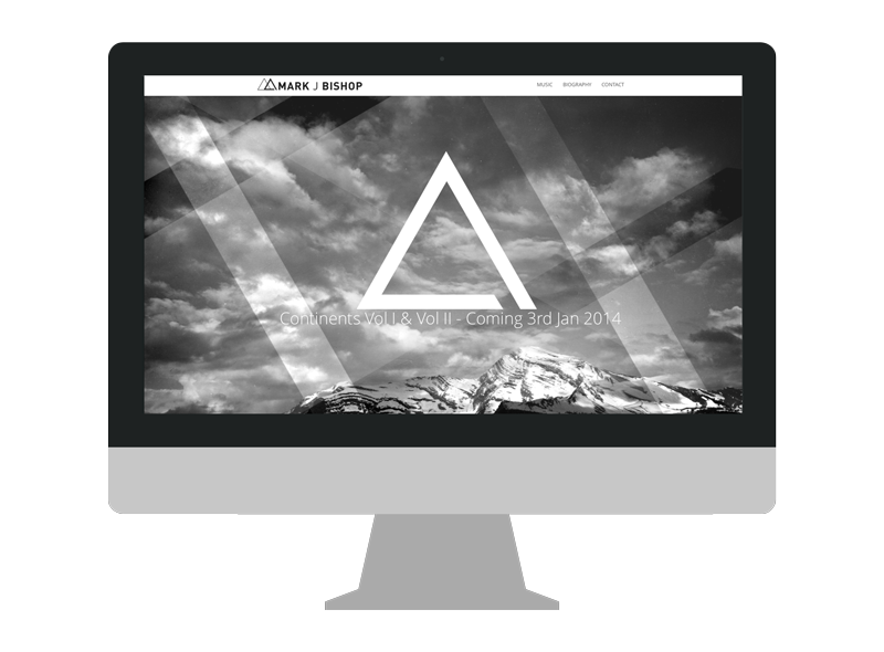
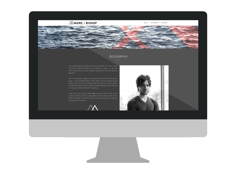
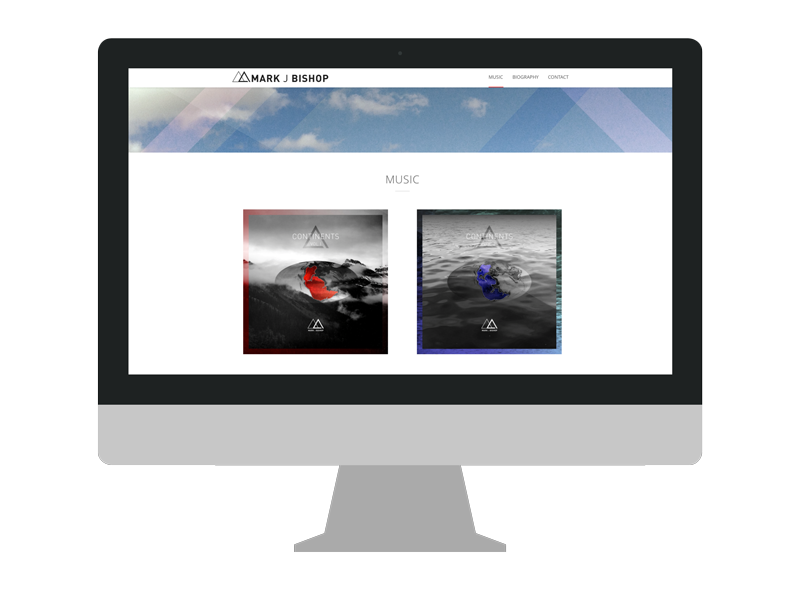
MARK J BISHOP
BRANDING / ARTWORK
–
Mark J Bishop is a composer of electronic orchestral music, living and working in Vancouver, BC. His music is all done electronically and when you listen to it, you feel its epic scale. Recently I had the great opportunity to help him create an image for himself through branding and artwork, just in time for his release of his first EP titled 'Continents'.
LOGO
For Mark, I chose to use the typeface DIN. We wanted to create a modern word mark that reflects the style of his music which is more clean and sophisticated.
Mark's logo was designed heavily around the influence of a triangle. He was particularly interested in the idea of Gestalt's law of closure and how it is represented with the triangle.
–
COLOURS
Black, white and shades of grey. Simple, timeless and out of the way so the music takes stage.
–
ALBUM ART
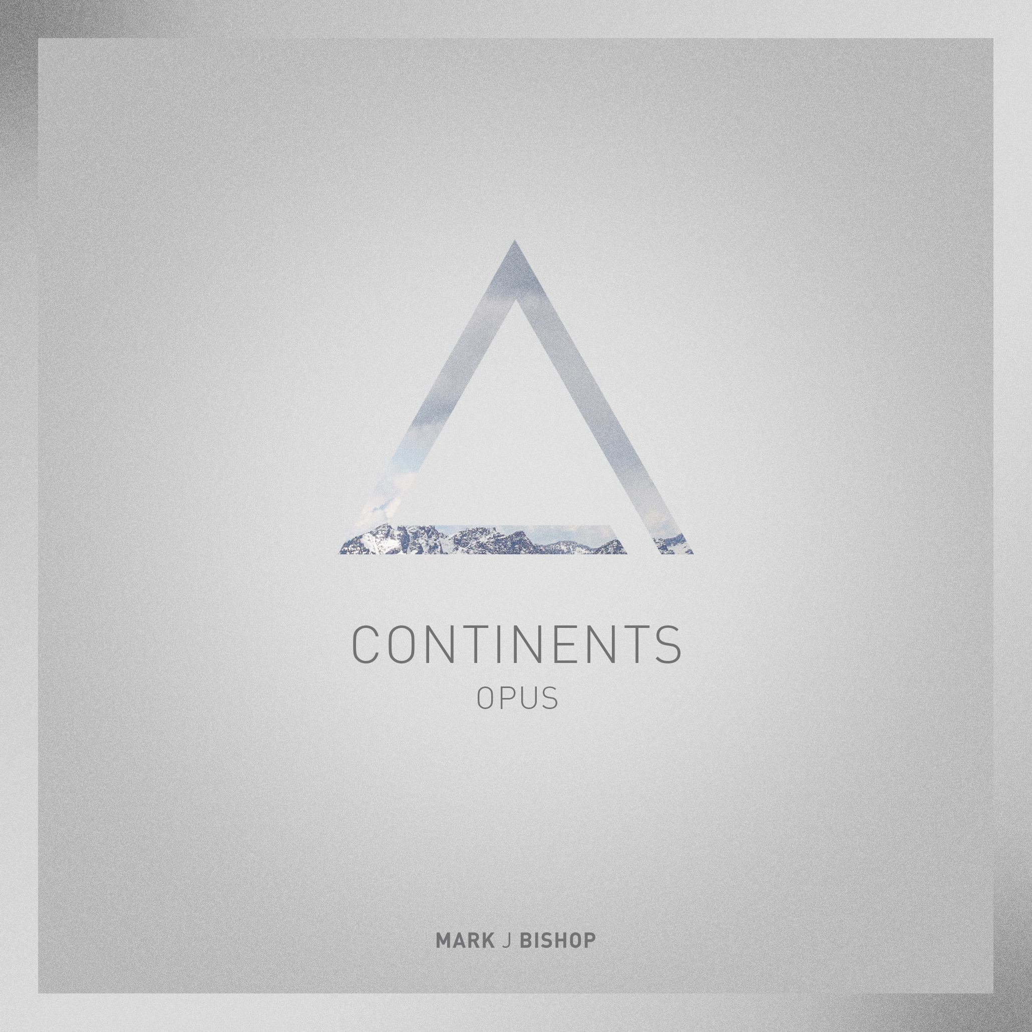



Continents will be released through 4 separate volumes. Artwork was created specifically for each unique volume. Strong references with nature and environment all come together to help support the epic scale of Mark's music.
–
PHOTOGRAPHY
Portraits created for use on his website and other art assets.
–
WEBSITE
